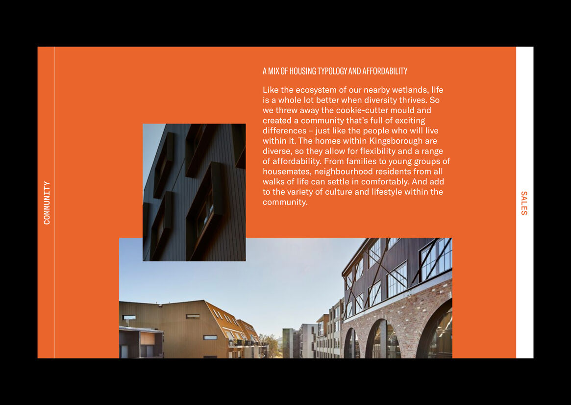
Kingsborough Village is an emerging precinct in the eclectic suburb of Kingston. Earlier iterations of the brand, developed during the precinct’s pre-sale phase, were quickly outgrown, providing ample opportunity for repositioning. Our team developed the tagline “live the good life, love your community” to guide the new identity towards the fostering of a thriving community which extends beyond sales. The new identity reflects a community-centric approach inspired by the area’s unique history, architectural significance and residents’ modern lifestyles. The Kingsborough campaign was aimed at attracting like-minded people, emphasising community and local activity. The contemporary build within a traditional landscape evokes the idea of a collaboration between old and new. A personality-rich approach engages locals and entices prospective members by encouraging a safe and vibrant environment for locals to interact. The project acts as a catalyst for future community-led urban living environments, empowering residents to take care of their living environment, improving their overall quality of life and inspiring a sense of belonging.
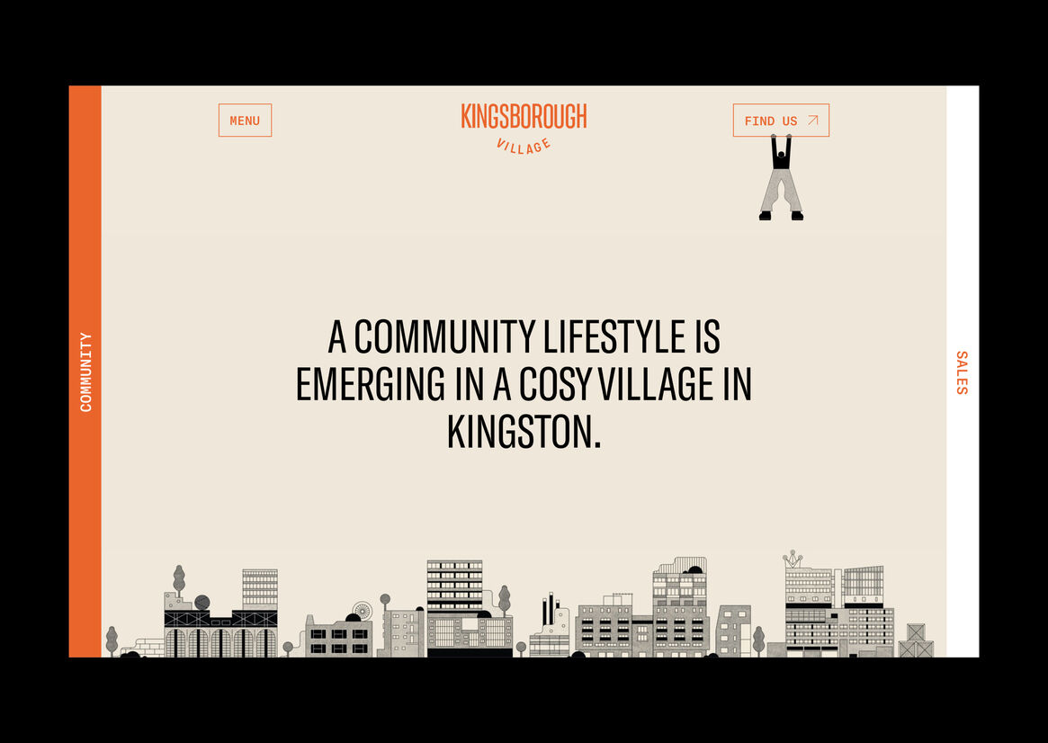
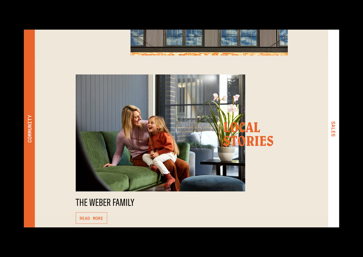
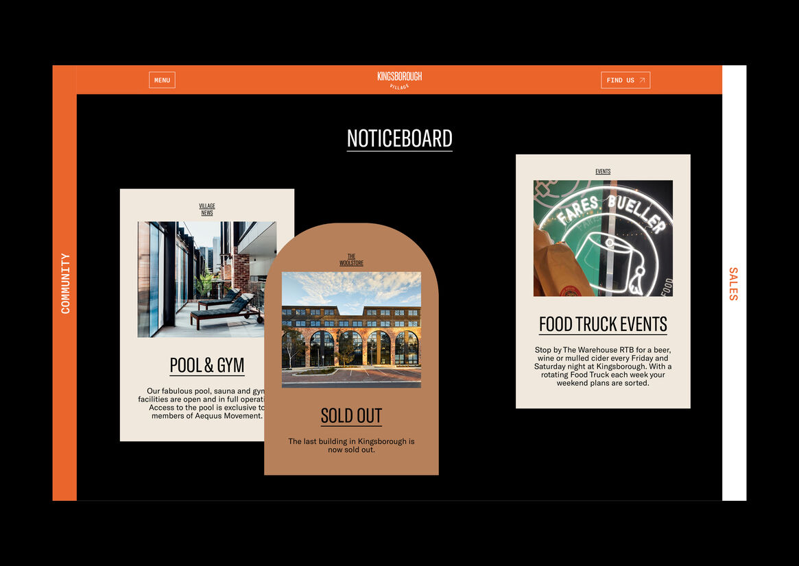
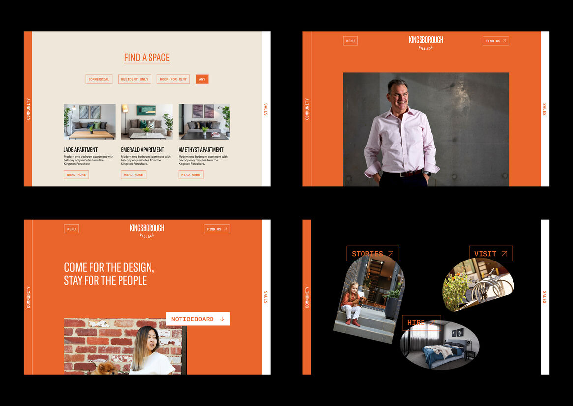
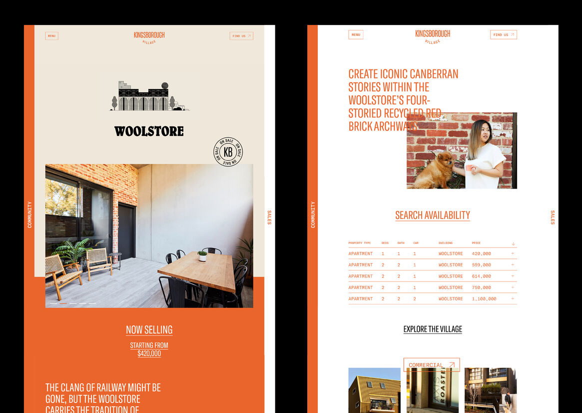
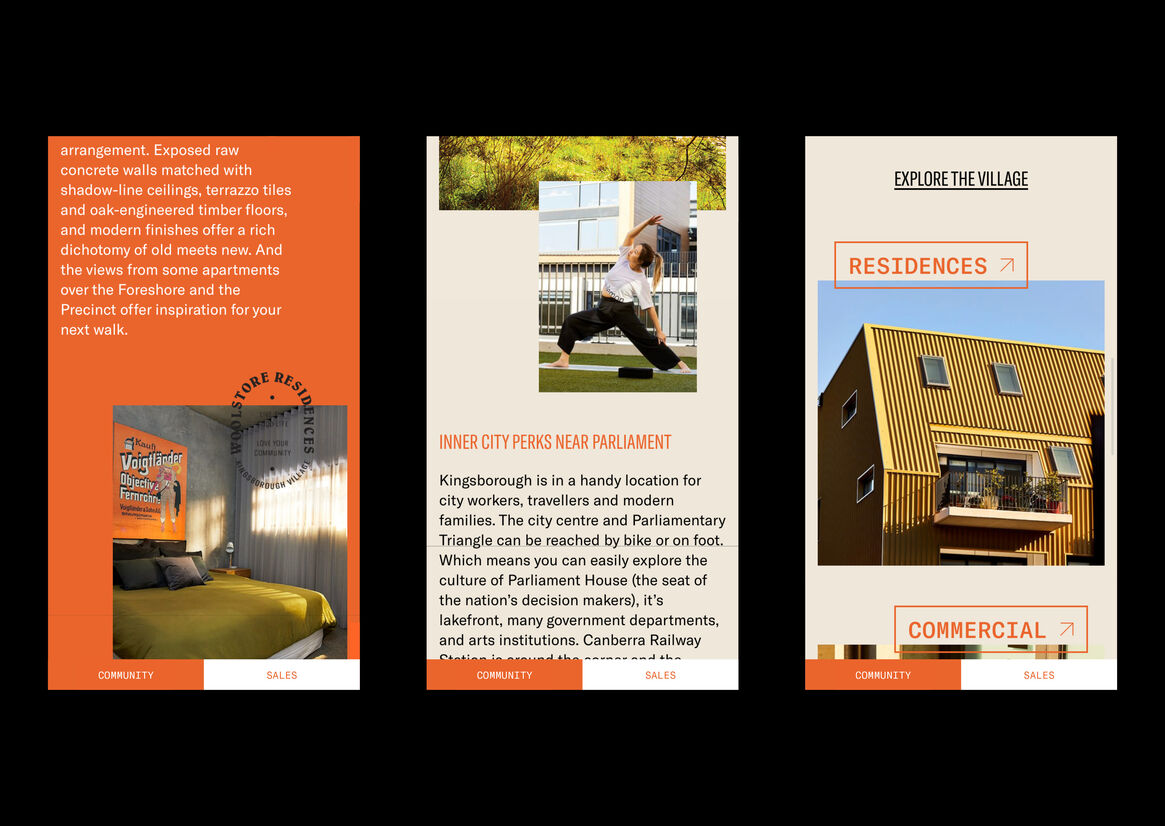
The website’s design is sophisticated, gritty and raw, drawing inspiration from the area’s rich, industrial origins whilst challenging the expected landscape of the property development industry. Featuring bold type and quirky illustrated characters that embody the diverse community, the website was developed to bypass real-estate channels, and be used as a tool to increase visibility and neighbourhood involvement. The website acts as a hub for residents, providing an emotional connection to the community online. The community section noticeboard encourages ongoing usage from the residents, rather than acting as a short-lived sales site. Relevant articles, upcoming events and precinct news are neatly posted for the ease of existing tenants’ consumption. Additionally, the public nature of the listings extends a welcome to prospective tenants, providing an insight into their future home. Website copy contextualises the brand, immersing the audience in sensory language complemented by crisp photography. The warm burnt orange and off-white colour palette is reminiscent of Canberra’s red-brick heritage. The brand appeals to a wide demographic, offering an authentic, people-driven approach to property development.
We developed a customer-centric approach which satisfies both existing and potential residents, welcomes visitors and details the precinct’s community appeal to drive future sales. The website’s self-paced lazy loading of content is punctuated by subtle animations as the user progresses through the site, reflecting the slower pace of the development as a whole and preventing users from becoming overwhelmed by dense content as they explore. The website’s navigation is unusual yet intuitive, divided into three sections of “Community”, “Home” and “Sales” with a sideways scrolling navigation bar ensuring users remain oriented at all times. To overcome low conversion rates despite strong sales enquiries through social and digital channels, we sought to simplify and centralise a convoluted listing process which concerned multiple third parties. Introducing sales listings to the website, followed by more accurate user-flows, the website granted our client the independence to manage sales from end-to-end, track data and take control of the creative vision for each property. The entire village has since sold out.
Description:
Kingsborough Village is an emerging precinct in the eclectic suburb of Kingston. Earlier iterations of the brand, developed during the precinct’s pre-sale phase, were quickly outgrown, providing ample opportunity for repositioning. Our team developed the tagline “live the good life, love your community” to guide the new identity towards the fostering of a thriving community which extends beyond sales. The new identity reflects a community-centric approach inspired by the area’s unique history, architectural significance and residents’ modern lifestyles. The Kingsborough campaign was aimed at attracting like-minded people, emphasising community and local activity. The contemporary build within a traditional landscape evokes the idea of a collaboration between old and new. A personality-rich approach engages locals and entices prospective members by encouraging a safe and vibrant environment for locals to interact. The project acts as a catalyst for future community-led urban living environments, empowering residents to take care of their living environment, improving their overall quality of life and inspiring a sense of belonging.
The website’s design is sophisticated, gritty and raw, drawing inspiration from the area’s rich, industrial origins whilst challenging the expected landscape of the property development industry. Featuring bold type and quirky illustrated characters that embody the diverse community, the website was developed to bypass real-estate channels, and be used as a tool to increase visibility and neighbourhood involvement. The website acts as a hub for residents, providing an emotional connection to the community online. The community section noticeboard encourages ongoing usage from the residents, rather than acting as a short-lived sales site. Relevant articles, upcoming events and precinct news are neatly posted for the ease of existing tenants’ consumption. Additionally, the public nature of the listings extends a welcome to prospective tenants, providing an insight into their future home. Website copy contextualises the brand, immersing the audience in sensory language complemented by crisp photography. The warm burnt orange and off-white colour palette is reminiscent of Canberra’s red-brick heritage. The brand appeals to a wide demographic, offering an authentic, people-driven approach to property development.
We developed a customer-centric approach which satisfies both existing and potential residents, welcomes visitors and details the precinct’s community appeal to drive future sales. The website’s self-paced lazy loading of content is punctuated by subtle animations as the user progresses through the site, reflecting the slower pace of the development as a whole and preventing users from becoming overwhelmed by dense content as they explore. The website’s navigation is unusual yet intuitive, divided into three sections of “Community”, “Home” and “Sales” with a sideways scrolling navigation bar ensuring users remain oriented at all times. To overcome low conversion rates despite strong sales enquiries through social and digital channels, we sought to simplify and centralise a convoluted listing process which concerned multiple third parties. Introducing sales listings to the website, followed by more accurate user-flows, the website granted our client the independence to manage sales from end-to-end, track data and take control of the creative vision for each property. The entire village has since sold out.