Blunt umbrellas are an award-winning iconic Aotearoa New Zealand product. Beautifully designed, they are a true kiwi innovation. But this love for Blunt was limited to our shores.
Through research, we discovered the current brand was just a sales portal, lacking emotional connection. We needed to connect the existing product love to brand love, bringing heart and character together with a rich visual language.
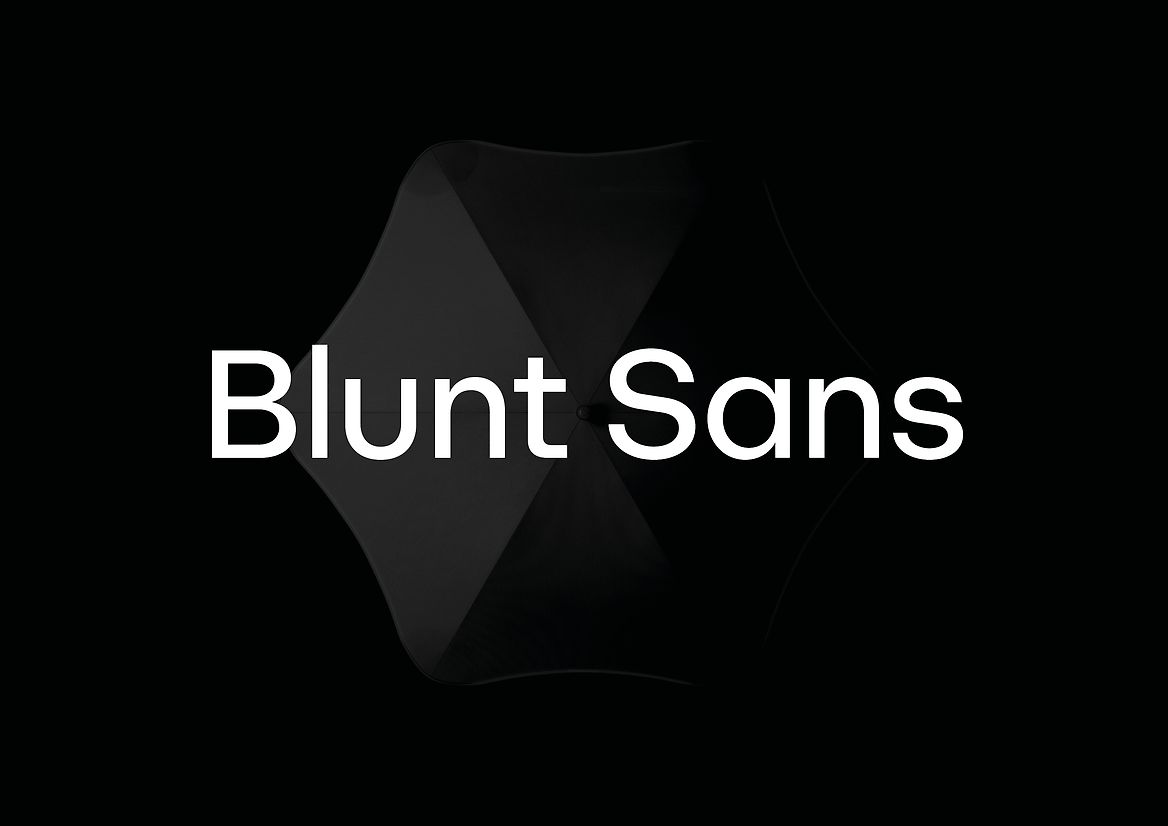
Unique typography is a critical distinctive ingredient within a characterful identity system, bringing depth and meaning to brand. As part of a full reinvention of the global brand, we created the custom type family, Blunt Sans.
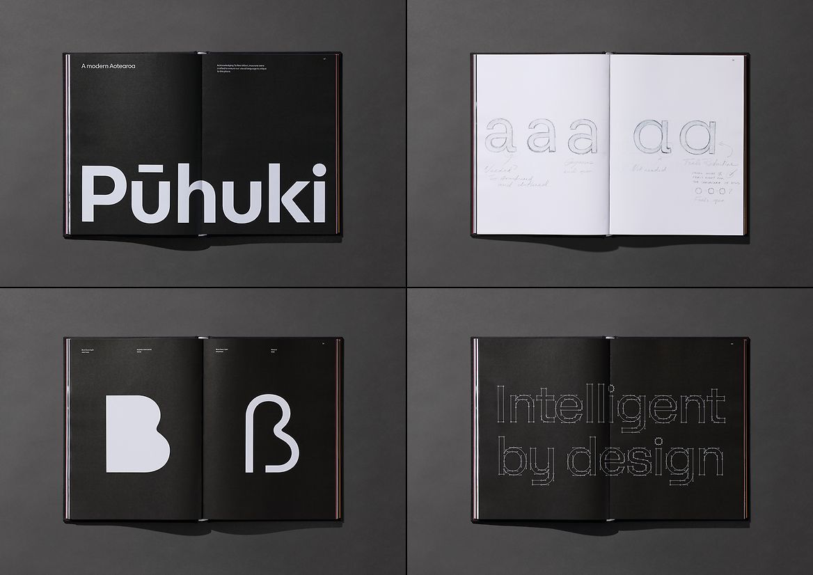
The process started with comprehensive exploration, delving deep into research, design, and engineering to bring forth a bespoke typeface. Working hand in hand with founder, Greig Brebner, we set out to create a typeface that not only resonated with him personally but also mirrored his design philosophy.
Our research journey led us to highly functional and versatile type families, drawing inspiration from the visionary works of Paul Renner and his reductionist approach in 'Futura,' as well as the influence of geometric expressions of Avant Garde.
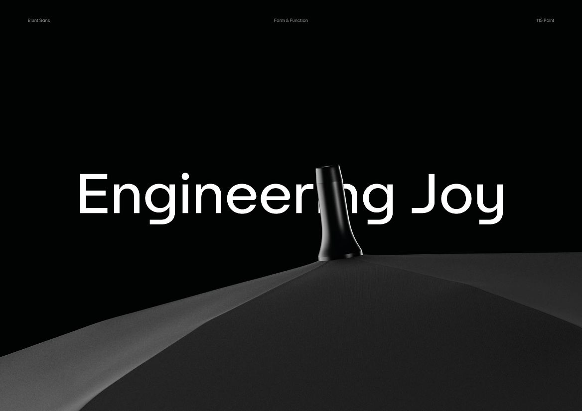
The guiding force for Blunt Sans was our overarching brand idea "Engineering Joy". A positive tension between their core skillset, engineering, and the joyful emotive outtakes of the consumer.
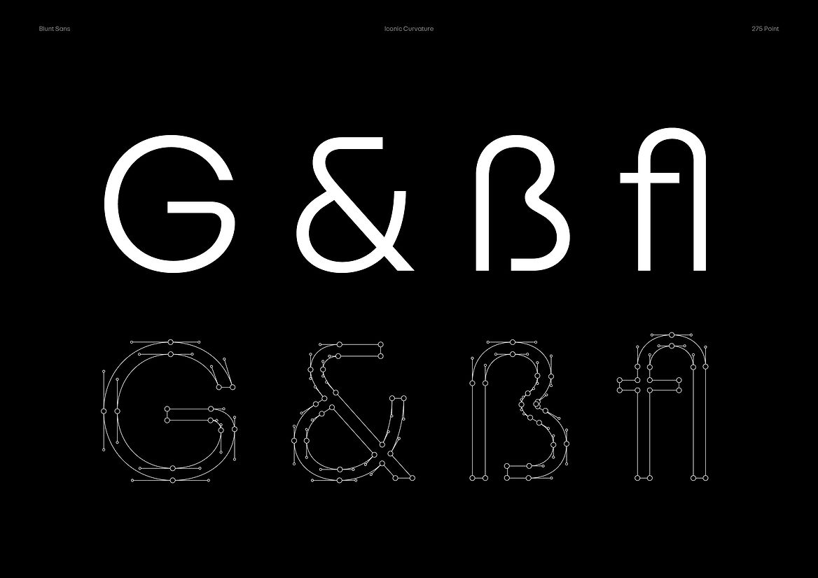
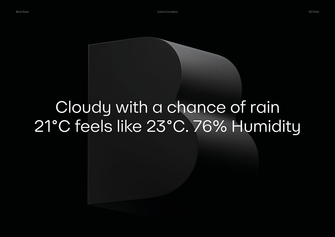
Blunt Sans fully embraces the core Blunt principles of confidence, joy, reduction, and beauty. The iconic Blunt curvature is delicately incorporated into signature letterforms with subtle curved inner and outer apexes, reflecting the distinctive product form. These elements coexist harmoniously with optically enhanced geometric proportions, infusing a functional utilitarianism into the typeface.
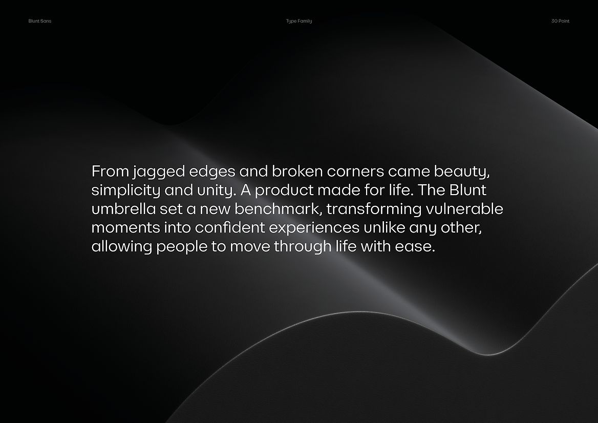
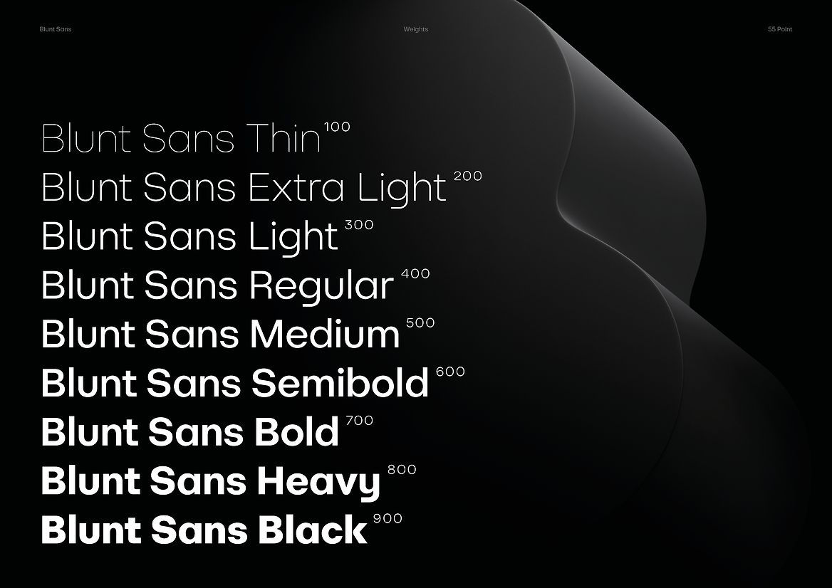
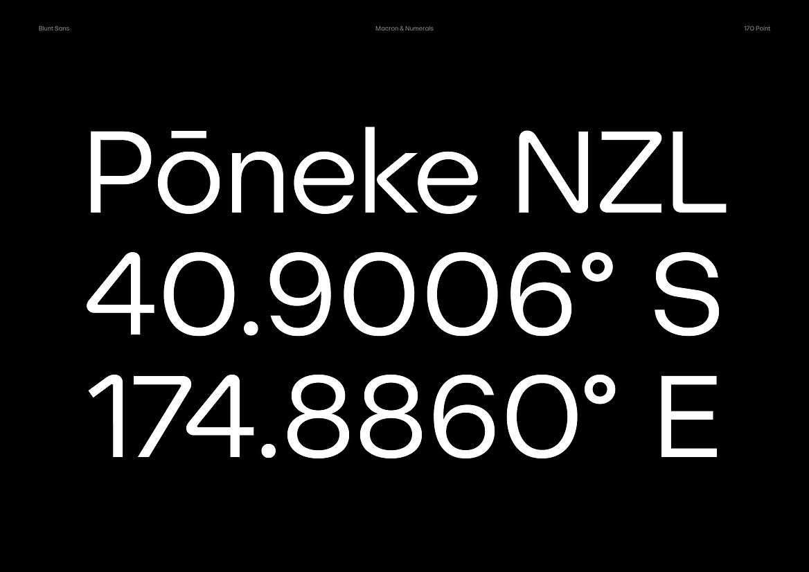
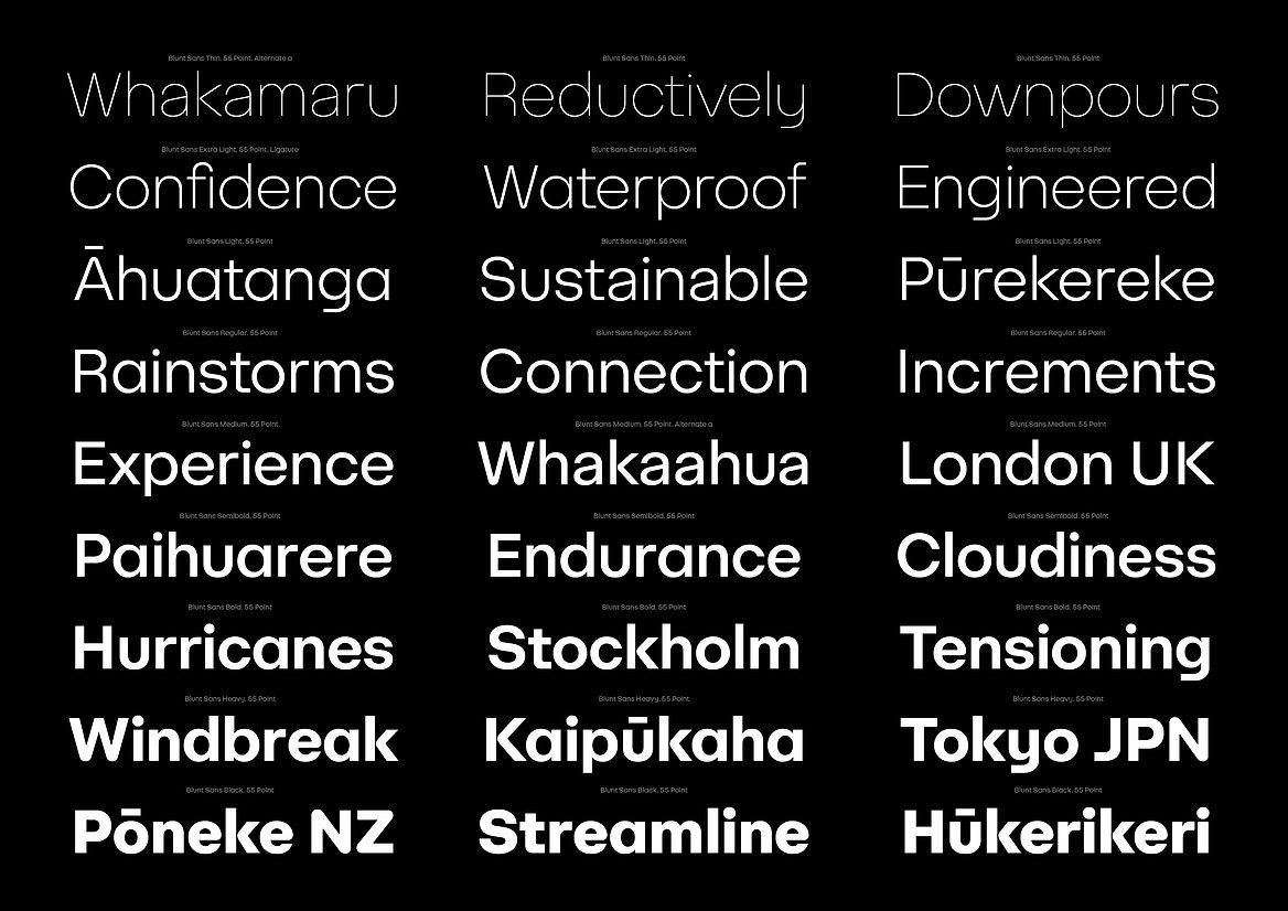
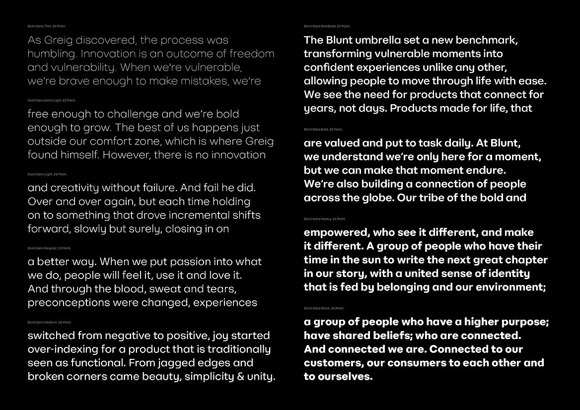
Its larger, open counters and taller x-height exude confidence and boldness, reflecting Blunt's pioneering attitude. Featuring 9 weights from Thin to Black, the highly refined and flexible typeface is both practical and beautifully simple. With optimum legibility across various sizes and applications, it caters to diverse consumers and products. To be truly global, the comprehensive character set supports over 150 languages, boasting a wide range of features like ligatures, fractions, superior numerals, arrows, and more, facilitating precision typesetting. OpenType features offer swift access to stylistic alternates, granting full control over the visual language's character-full or reductive aspects.
The Blunt Sans type family delivers a richer, deeper more meaningful visual language for Blunt. Expressing an effortless confidence, intelligence, and subtle character. A seamless extension of the iconic Blunt forms that people so dearly know and love. Blunt Sans is a core, characterful ingredient helping to take their beautifully designed, human centred products to the world.
Description:
Blunt umbrellas are an award-winning iconic Aotearoa New Zealand product. Beautifully designed, they are a true kiwi innovation. But this love for Blunt was limited to our shores.
Through research, we discovered the current brand was just a sales portal, lacking emotional connection. We needed to connect the existing product love to brand love, bringing heart and character together with a rich visual language.
Unique typography is a critical distinctive ingredient within a characterful identity system, bringing depth and meaning to brand. As part of a full reinvention of the global brand, we created the custom type family, Blunt Sans.
The process started with comprehensive exploration, delving deep into research, design, and engineering to bring forth a bespoke typeface. Working hand in hand with founder, Greig Brebner, we set out to create a typeface that not only resonated with him personally but also mirrored his design philosophy.
Our research journey led us to highly functional and versatile type families, drawing inspiration from the visionary works of Paul Renner and his reductionist approach in 'Futura,' as well as the influence of geometric expressions of Avant Garde.
The guiding force for Blunt Sans was our overarching brand idea "Engineering Joy". A positive tension between their core skillset, engineering, and the joyful emotive outtakes of the consumer.
Blunt Sans fully embraces the core Blunt principles of confidence, joy, reduction, and beauty. The iconic Blunt curvature is delicately incorporated into signature letterforms with subtle curved inner and outer apexes, reflecting the distinctive product form. These elements coexist harmoniously with optically enhanced geometric proportions, infusing a functional utilitarianism into the typeface.
Its larger, open counters and taller x-height exude confidence and boldness, reflecting Blunt's pioneering attitude. Featuring 9 weights from Thin to Black, the highly refined and flexible typeface is both practical and beautifully simple. With optimum legibility across various sizes and applications, it caters to diverse consumers and products. To be truly global, the comprehensive character set supports over 150 languages, boasting a wide range of features like ligatures, fractions, superior numerals, arrows, and more, facilitating precision typesetting. OpenType features offer swift access to stylistic alternates, granting full control over the visual language's character-full or reductive aspects.
The Blunt Sans type family delivers a richer, deeper more meaningful visual language for Blunt. Expressing an effortless confidence, intelligence, and subtle character. A seamless extension of the iconic Blunt forms that people so dearly know and love. Blunt Sans is a core, characterful ingredient helping to take their beautifully designed, human centred products to the world.